
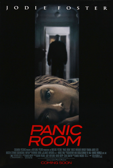
This is the poster for the film Panic Room. As you can see the layout and style of the poster is pretty simple. It has a simple but effective picture positioned in the centre, which could be used to show the genre of the film to the audience. It shows the main actress Jodie Foster's face at a horizontal angle, this shows how she is laying on the floor, also her facial expression shows how she could be scared or frightened which could suggest to the audience that the film is going to feature the genre or sub-genre of horror or thriller. In addition there is a figure of a man whose identity is not shown, this could suggest some kind of mystery, or an unexpected event. It could also give the audience the impression that the man in the background is going to have to sort of conflict with the character at the front, which could then give the audience the impression that the genre is going to involved action with a sub genre of horror or thriller. Also the clothing and appearance of this man, could also influence the audiences opinion of what the genre of the film is, his face is not shown, and he is wearing all black clothing, which could suggest that he is the villain of the film and therefore gives the impression of the binary opposition good vs bad, which is typical in action/thriller films. The title of the film could also affect how the genre is communicated to the audience. The word 'Panic' gives a sense of danger and threat, and could make the audience think that there is going to be some sense of panic or commotion between the two characters in the picture.
In my opinion the unique selling point of this poster is probably the actress Jodie Foster. Her name is clearly stated at the top of the poster, and her face is shown in the middle of the poster to show how she is the main character in the film. Also she is the only actor/actress who is mention on the poster to a large extent, this could show how she is the most known actor/actress to feature in the film. So having her name clearly stated on top of the poster could attract people who have seen any of her previous films, and may influence them to watch this one.
The title 'Panic Room' is printed just below the picture, it is printed in a bold font to clearly stand out the audience, and is also printed in the colour red. The use of the colour red could of been used to symbolise that there was going to be danger, violence or blood as these things are usually associated with the colour red. This is typical of the horror/thriller genre as danger and violence are also conventions that are associated with them genres. Below the title is the small print which mentions the other actors, the director, producer etc, it also states that it is a film by Columbia Pictures, this could also attract another audience as Columbia pictures are a well known company and may already have a fan base to their films such as Bad Boys, Men in Black and Spider Man. Underneath all of this, it is printed red that the film is coming soon, this doesn't give the audience a clear time when the film is being released.
The poster could give some idea of a target audience, as the title and picture could suggest that the film is an action, horror or thriller. So people who are interested in these particular genres my be influenced to see this film. Also by clearing stating and showing that the main actress in the film is Jodie Foster could also attract another particular target audience as people may have seen her in previous films such as 'Nell' (1994) and 'Contact' (1997), people may have been impressed with her acting and the storyline of them films, and this may influence them to see this one. Lastly, that fact that it states that it is a film by Columbia pictures is a big factor in attracting a target audience, as Colombia pictures is a well known company and has produced big films in the past such as Spider Man, Men In Black and Stuart Little.
Excellent Joe. Well done!
ReplyDelete